In the beginning:
Sewing machines and bicycles
1862
1888
1889
1893
1914
1920
1928
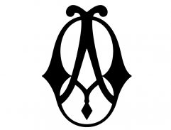
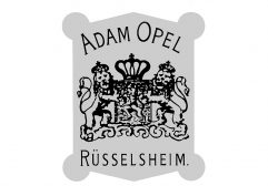
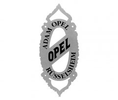
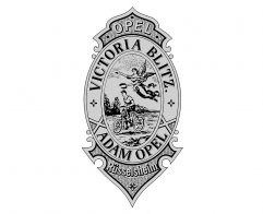
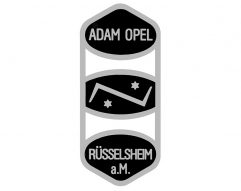
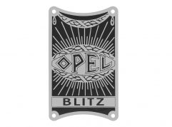
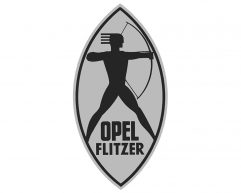
The new businessman Adam Opel proudly presented his initials ‘A’ and ‘O’ on the cast iron side panels of his sewing machines. Over the years he varied the company logo but always kept the two letters of his initials. In 1887 Adam Opel expanded production and began manufacturing bicycles in addition to sewing machines. Over the decades, the bicycles were adorned with a wide variety of head badges, first as a decal and later also as a nickel-plated brass plaque. As early as 1889, the term Blitz appeared with various models, sometimes combined with other names such as Saint Hubertus or Victoria, the Roman goddess of victory.
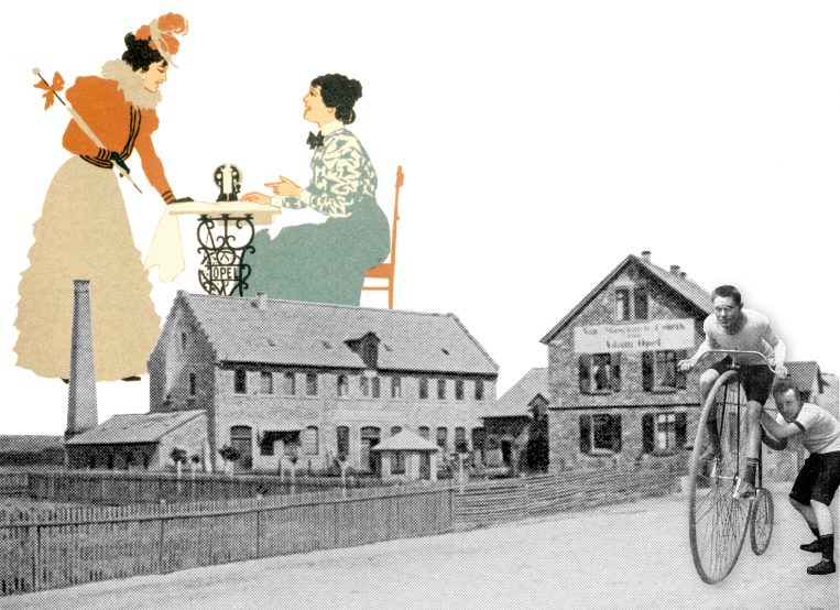
All beginnings: The initials ‘A’ and ‘O’ as well as the family name adorn the sewing machines from Rüsselsheim, the bicycles are adorned with various head badges.
![]()
Automobile production takes off
with Sophie Opel and Friedrich Lutzmann
1899
1902
1904
1905
1908
1909

1935
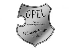
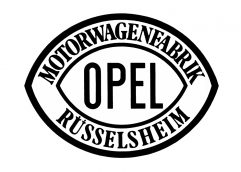
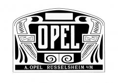
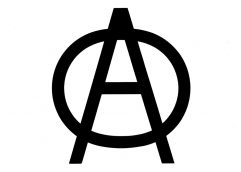
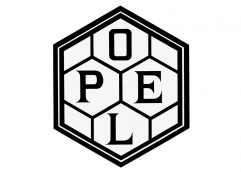
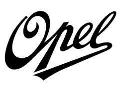
Four years after the death of company founder Adam Opel, Sophie Opel and her sons turned to automobile production in 1899. They started by taking over the Anhaltische Motorwagenfabrik from Friedrich Lutzmann, who adorned the sides of his vehicles with a stately polished emblem. After Lutzmann moved his team and production facilities to Rüsselsheim and his motor coaches were marketed as Opel cars, he also modified the text on the emblem. After ending the Lutzmann collaboration, from 1902 onwards the Opel models were equipped with a much smaller brass signet, which introduced the form of the subsequent “Opel Eye”. Around 1904, a ‘creative phase’ began in the badging of the Rüsselsheim models. Most experimentation took place with the “Opel” lettering in advertising as well as on the radiator grilles of motor vehicles and on the tanks of motorcycles in the portfolio between 1901 and 1907. However, by today‘s standards this cannot be considered a logo – it was more of a decorative element that was still well received by customers in the mid-1930s in an updated form.
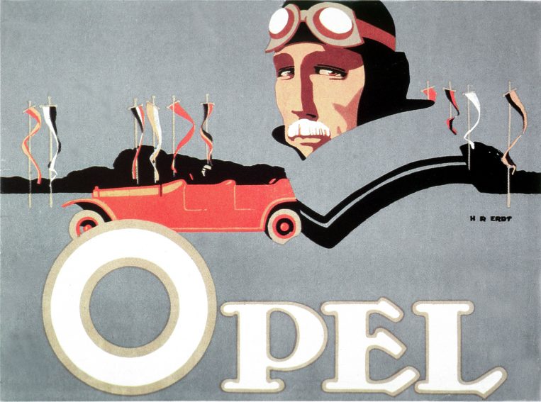
Focus on the lettering “Opel”: The colour lithograph (1911) is by Hans Rudi Erdt, an important poster artist of the time.
![]()
Opel Eye is first
enduring logo
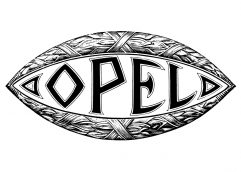
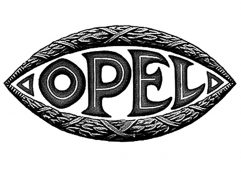
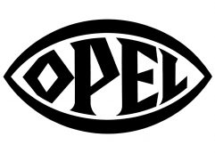
1910
1924
1928
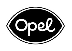
1934
1935
1937
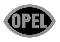
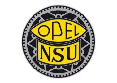
It is said that Grand Duke Ernst Ludwig of Hesse spontaneously sketched a draft at a meeting with Wilhelm Opel, who immediately took to it. In its basic form, the eye remained the official Opel logo until 1935. The last versions, one in a well-balanced cursive script and ultimately in modern san serif, were found on the radiator grilles of the P4, Olympia and 2-litre models as well as in advertising and printed materials from the late 1930s. The most famous Opel motorcycle, the 1928 Motoclub, also carried the Opel Eye. The Opel Eye was also used to badge Opel bicycles for many years, even after the sale of this business to NSU in 1937.
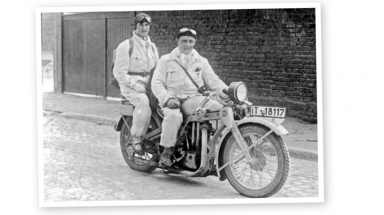
The Opel Eye at the 1928 Motoclub: It was in enamel on both sides of the front fork – in white/gold on a fire-red circle.
From Zeppelin to the Blitz –
many variants through the decades
1936
1937
1937
1938
1951
1953
1956
1956
1957
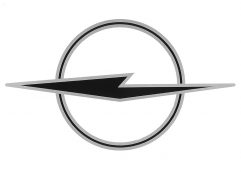
1963
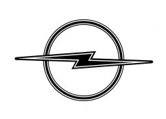
1963
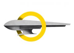
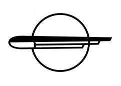
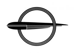
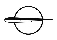
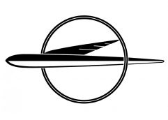
From 1934, a stylised Zeppelin adorned Opel vehicles as a hood ornament – once a symbol of human innovation and technical progress. For the two-dimensional representation, the emblem was integrated in a wheel, the symbol of human mobility on Earth. Numerous variations were created, in the 1950s always with the ‘dorsal fin’. The logos appeared on radiator grilles, steering-wheel hubs, wheel caps and rear lids as well as on various printed materials, mostly pointing to the left. In late 1963 the Zeppelin, which had become very abstract, was turned into a lightning bolt, the Blitz – a symbol that the Opel graphic designers had been using sporadically since 1930.
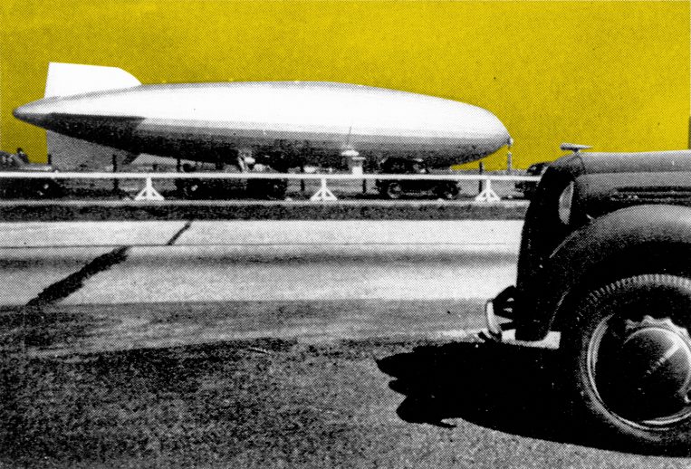
A symbol of innovation and progress: The “Hindenburg” and the Opel Olympia 1936 with the stylized Zeppelin as a hood ornament .
![]()
The name Blitz –
from bicycle to truck
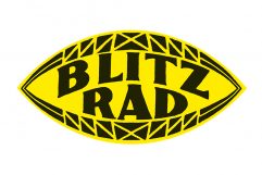
1930
1930
1936
1936
1952
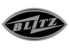
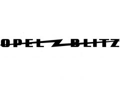
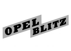
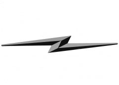
In 1930 Opel searched for a catchy, five-letter name for the new delivery truck (Schnell-Lastwagen) in a Germany-wide competition. A familiar name won: “Blitz”. The legendary lightning bolt symbol was arranged for the corresponding logo for the first time; initially in the Opel Eye, later without it. The name of the now world-famous logo thus traces its origins back to the early Opel bicycles. The graphic representation, on the other hand, goes back to the 1930 truck.
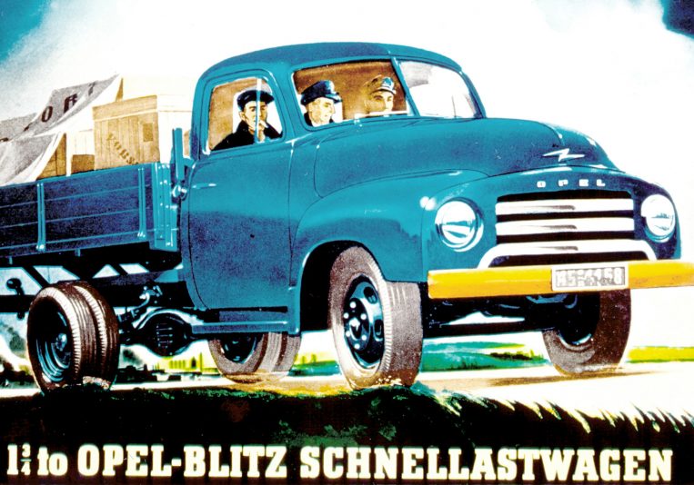
Advertising motif (1952 to 1956): The Opel Blitz 1.75 tons with the legendary lightning bolt symbol.
Logo for customer service
and service stations
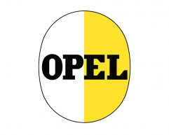
1937
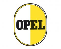
1950
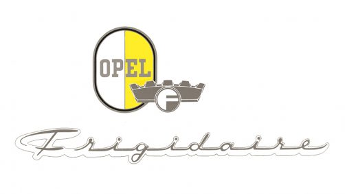
In the 1950s and 1960s, the oval sign with the inversion of the yellow/white colours in the border officially served as company logo for Opel and its dealers, who were also called ‘service stations’. The original form of the logo had already been developed in 1937 concurrently to the Zeppelin symbol. The “Frigidaire” refrigerators produced by Opel in Germany between 1949 and 1959 also featured the yellow/white oval. After the introduction of a new Corporate Identity in 1970 the “Opel egg” slowly disappeared from the public eye.
Evolution of a legendary symbol
1964
1970
1978
2002
2007
2009
2016
2017
All 1964 model year cars delivered from the autumn of 1963 onwards carried the new Blitz in a circle. Depending on the model and year of manufacture, the emblems vary slightly, but the pursuit of a uniform brand identity is clearly discernible. From 1970 onwards, clear design guidelines were established for all corporate divisions. In advertising, for printed matter, signs and badges, the Blitz was combined with the Opel name and framed by a square. In this form, the logo also identified the dealerships at home and abroad. In 1987 the Corporate Design was remodeled for the first time: both the yellow colour and the square were scaled down. In the new millennium, further modernisations followed in which the Blitz was given a 3D look. The objective was to enhance the similarity between the company logo and the product emblem.
Since 2016, new Opel products have been adorned with a precisely sculptured chrome Blitz. The official company logo has featured a modern flat design since the summer of 2017.
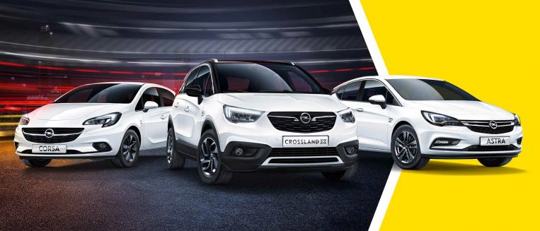
Anniversary year: The brand with the chrome Blitz celebrates 120 years of automobile production.
Opel slogans through time
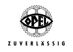
Opel – reliable
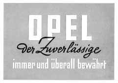
Opel, the reliable one
Proven anytime and anywhere
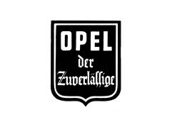
Opel, the reliable one
Opel, the reliable one
Tested reliability
Opel, the reliable one
Reliability for the future
Reliability for the future
Inspiring technology.
Opel. Fresh thinking – better cars.
Experience Opel
We live cars.
March 2019
